








How can a complex enterprise platform become easier to understand and work with without reducing the flexibility advanced users need?
Home experience: recent work, favourites and quick actions in one place
One of my main projects was redesigning the IX25 home experience.
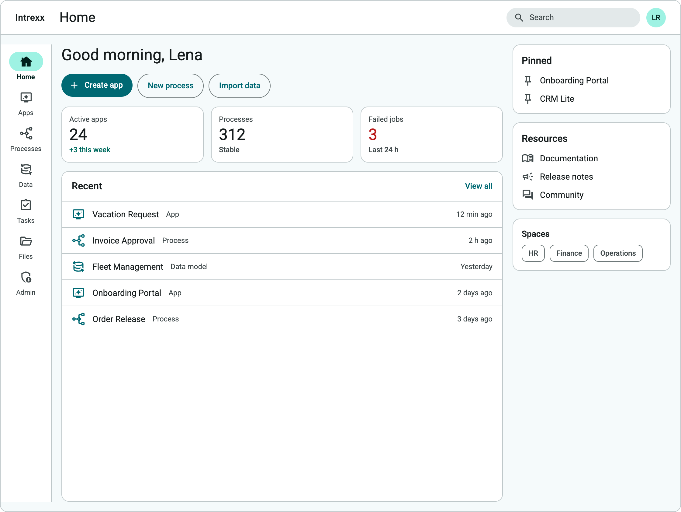
Users needed fast access to different parts of the platform without turning the home screen into another complex dashboard. I explored how recent work, favourites, resources, system information, and common actions could form a useful starting point.
I designed and iterated concepts around:
- Recent items and recent activity
- Favourites, pins, and ways to continue work
- Quick actions and creating new content
- Resources, shortcuts, and spaces
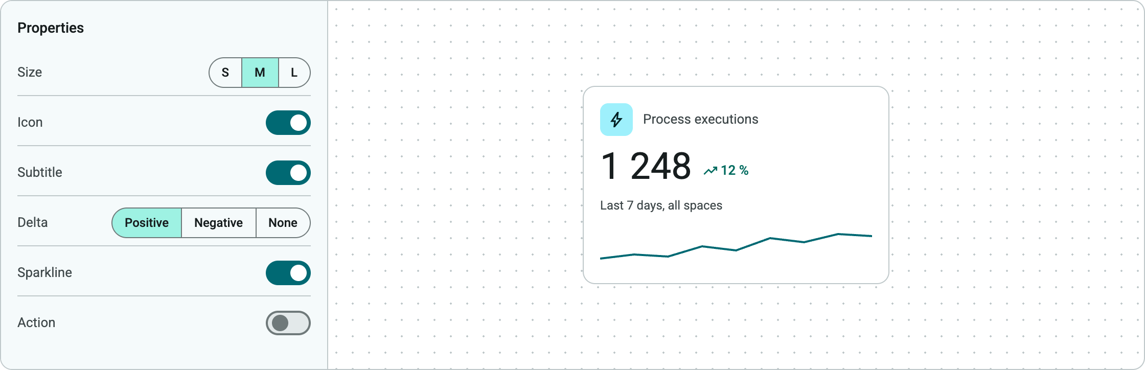
- Compact monitoring and KPI components
- Rich tooltips, information hierarchy, and navigation
One important information-architecture decision was distinguishing Recent, which showed items a user had recently accessed, from Recent Activity, which showed actions that had actually taken place. I also explored how much metadata each entry needed. Removing secondary actions, author information, and low-value details made the experience easier to scan.
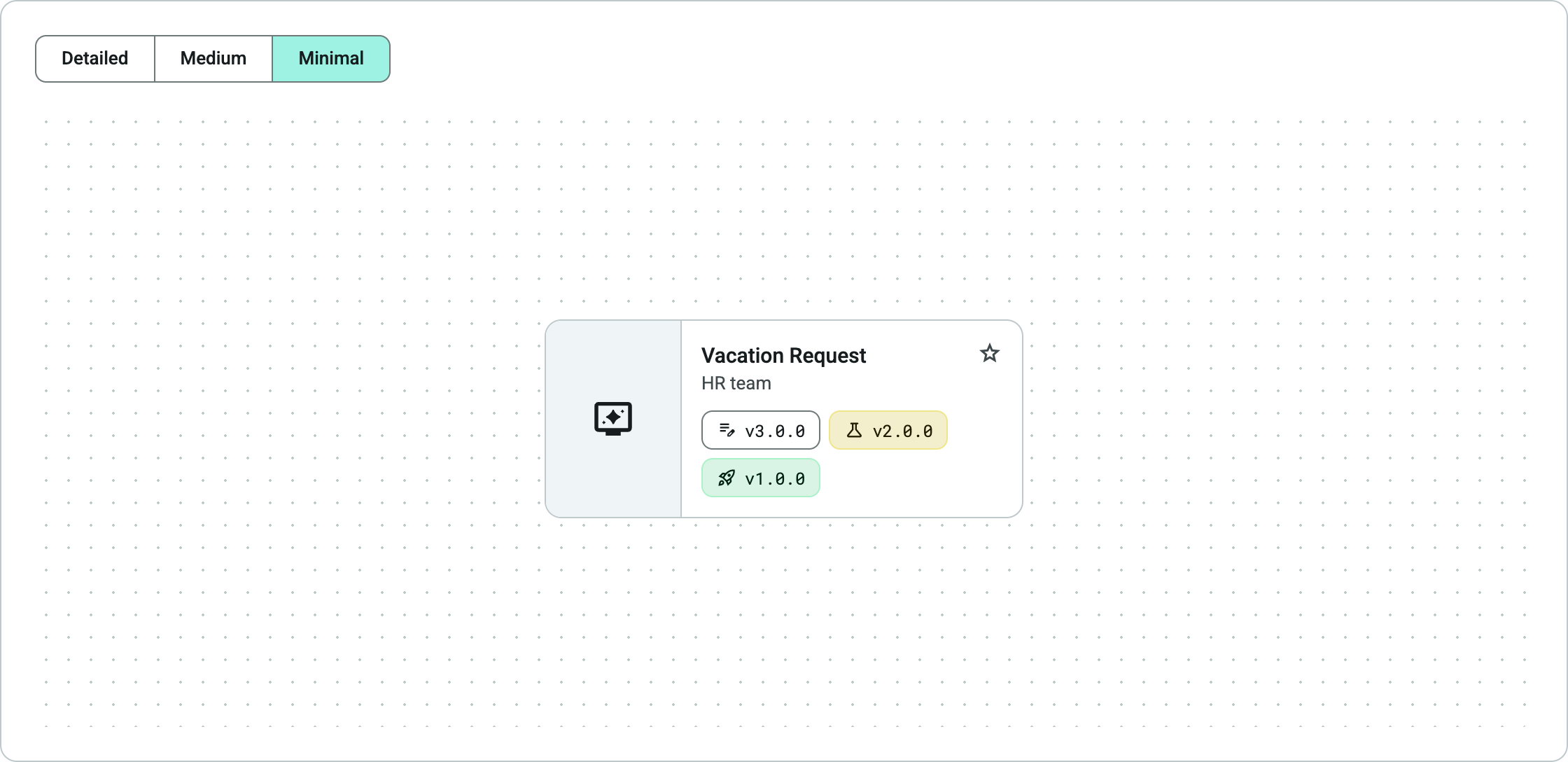
The home experience was built as a reusable component system rather than as one fixed dashboard. Cards, list items, actions, and metrics were broken down into smaller building blocks and aligned with the existing IX25 design system.
I also prepared research for the alpha version to understand how users interpreted the new structure, where they expected functionality to live, how quickly they could complete common tasks, and which elements created friction.
Theme Editor: making inheritance and overrides visible
The same challenge appeared in the IX25 Theme Editor.
Themes can exist across multiple levels of the platform, from a tenant or space down to individual apps and components. The interface therefore had to offer flexibility while making inheritance and overrides understandable.
I explored how users could manage colours, typography, branding, theme variants, and component styles while maintaining consistency across the product. This included colour inputs and selection, multiple themes, light and dark modes, typography, and considerations around open-licence or self-hosted fonts.
The core interaction problem was not the colour picker itself. It was helping users answer four questions:
- Which value is inherited?
- Where does it come from?
- What has been overridden?
- What will change if I edit or reset it?
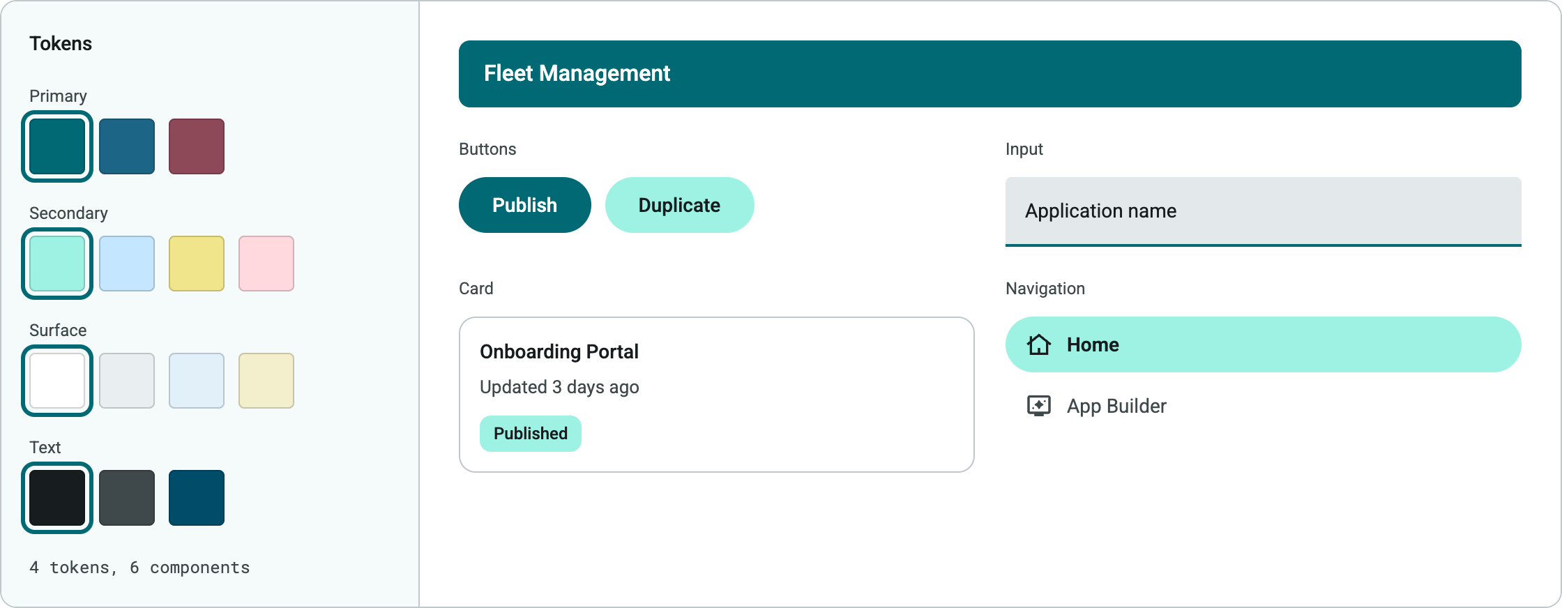
This work required close alignment with the existing IX25 design system. Instead of treating each feature independently, I worked with reusable patterns, Material 3-oriented components, variants, states, responsive behaviour, typography, spacing, and design tokens that could scale across different parts of the platform.
Accessibility was considered as part of the colour, typography, component, and interaction decisions.
Data Builder analytics: a debugging tool, not a report
Another project focused on analytics for the Data Builder.
Data engineers needed a way to inspect large volumes of read and write operations and identify performance problems, errors, and timeouts. They needed to answer questions such as: Which operations are slow? Where are failures happening? Which queries or commands require investigation? How is the system load behaving?
Instead of creating a traditional business dashboard, I designed the interface as an analysis and debugging tool.
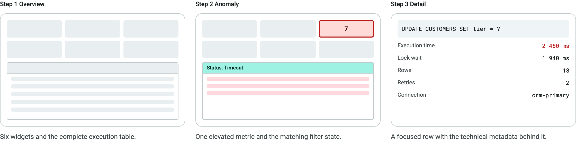
Six interactive widgets summarised information such as query and command execution times, performance, timeouts, errors, and system load. The detailed table below captured information such as operation type, execution time, counts, rows, cache hits, and status.
Selecting a widget could filter or organise the execution table, allowing users to move through a clear investigation flow:
Overview → Identify anomaly → Inspect details
This project required a different type of UX: high information density, technically oriented users, and interactions designed around diagnosis rather than presentation.
I applied similar thinking to data mapping and administrative features such as localisation management, where the relationships between languages, locales, default settings, and optional translation coverage had to be translated into a clear interface. Instead of displaying every field the system could provide, I questioned whether each item supported an actual task. For example, I excluded version information when no meaningful versioning model existed.
Onboarding and adoption: measuring outcomes, not clicks
Designing the product itself was only part of the challenge. IX25 also needed to help new and existing users understand a broad set of tools and concepts.
I evaluated Userpilot as a platform for combining product analytics with contextual onboarding and explored approaches for:
- Product tours for Home, App Builder, Process Builder, and Data Builder
- Tooltips, contextual guidance, tutorials, and a resource centre
- User profiles and segmentation
- Event tracking and triggers
- Funnels and usage analysis
- Session replay and privacy masking
- In-product release communication through flows, banners, spotlights, and changelog links
I compared how a platform focused primarily on analytics, such as PostHog, differed from a combined analytics and adoption approach. I also tested Userpilot in practice, including custom themes, light and dark modes, event triggers, browser and cache behaviour, and cases in which tours did not appear reliably.
A key part of this work was defining meaningful behaviour rather than simply tracking clicks.
For example, a Create App event could describe a user pressing a button, or the successful completion of the entire app-creation flow. Defining events around actual user outcomes makes analytics more useful for future product decisions. Segments such as new users in their first week could then receive relevant onboarding rather than generic guidance.
Website audit: one platform story, two calls to action
I also worked with marketing and leadership on a UX audit of the Intrexx website.
We reviewed positioning, navigation, information architecture, content, visuals, target audiences, conversion paths, accessibility, and URL structure. The audit identified issues ranging from outdated or overly long content and missing visual explanations to inconsistent icons, calls to action, link targets, and overlapping pages.
A strategic challenge was moving the story away from individual versions or disconnected features and toward Intrexx as one platform.
I translated the findings into a revised information architecture with clearer entry points for business, IT, and developer audiences. The proposed structure connected platform positioning with the Application, Process, and Data Builders, outcomes, social proof, cases, integrations, security, and focused conversion paths.
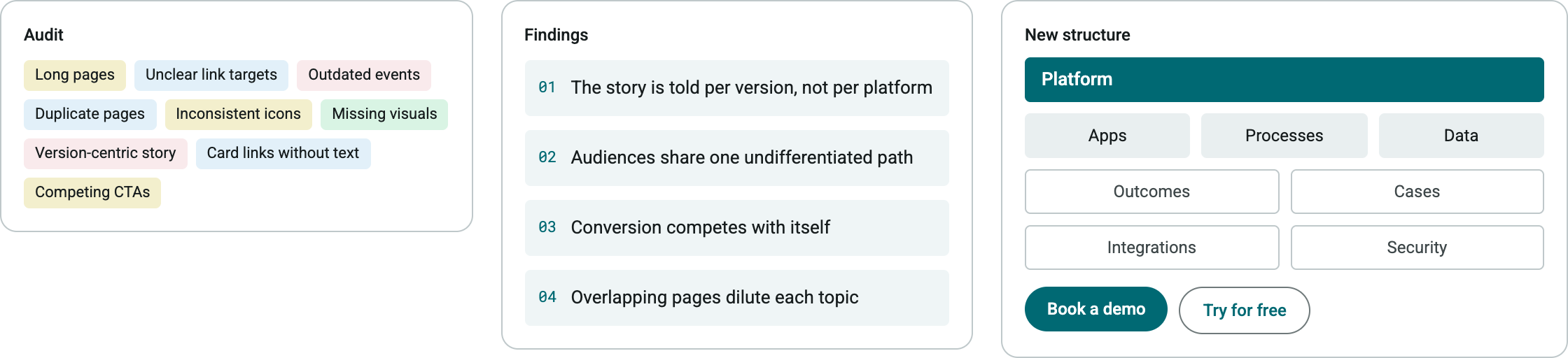
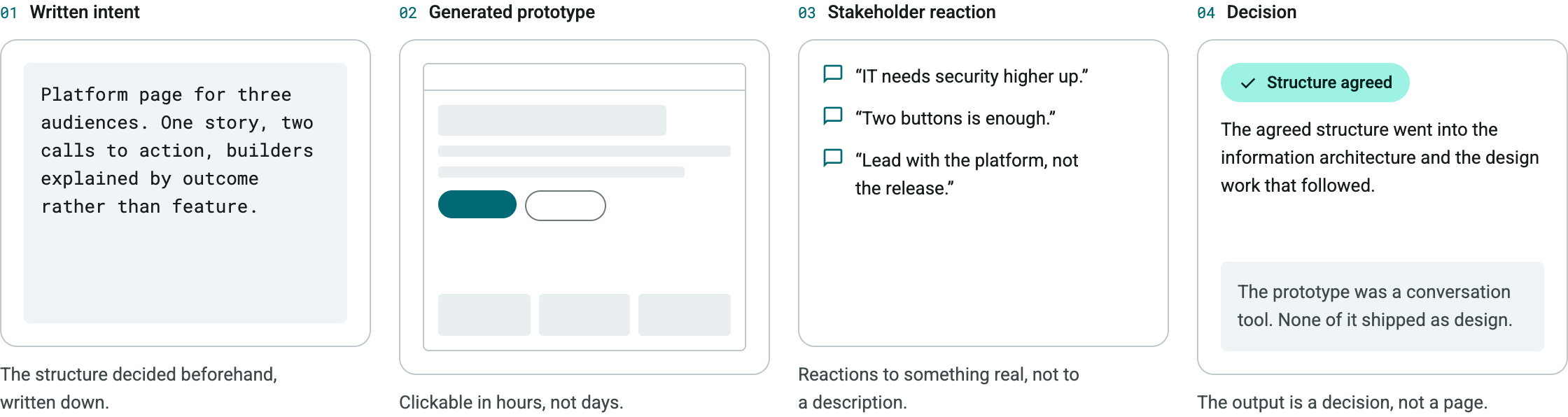
I also proposed standardising the primary calls to action around Book a demo and Try for free, reducing the number of competing choices. Early concepts were explored with AI-assisted prototyping tools to test page structures, interactions, and design directions quickly and make ideas tangible for stakeholders.
Looking back: one approach across five areas
Working on Intrexx meant designing for very different levels of complexity, from a first-time user’s home screen to technical analytics for data engineers.
The common thread was:
Show less on screen, and make every element answer a concrete question: which value is inherited, which query is slow, whether the app was actually created.
The work pushed my practice beyond individual UI screens. I worked across information architecture, interaction patterns, design systems, research, analytics, onboarding, product communication, and website strategy, and considered how decisions in one part of a large platform affect the rest of the experience.